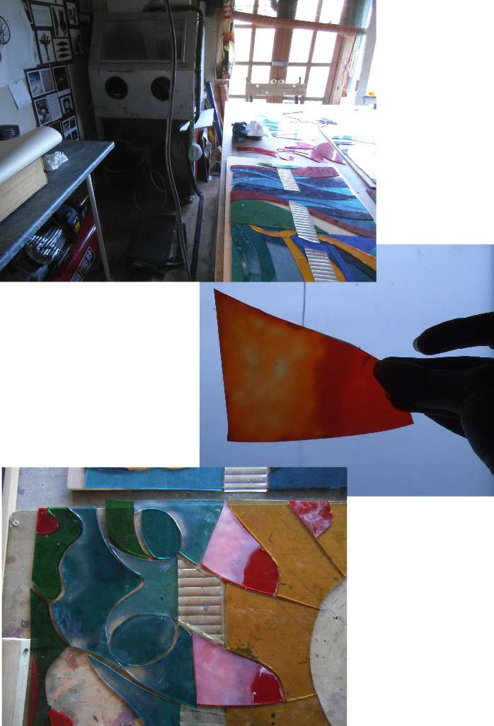
More sandblasting!
Well, after a few hiccups ( having to replace my air compressor being the main one!) I have managed to finish the sandblasting phase- the images show the glass before fire polishing. Putting the pieces in the kiln, and firing them to a temperature that is just before melting point, smooths any edges and makes the glass less opaque too, so it is easier to paint onto the surface.
I had a bit of fun with the sun- who knew the orange flash glass surface was so hard?? It took ages to sandblast the layers but got there in the end! Now to painting…
Sandblasting
Now to sandblasting!
In the old days you would remove the layer of colour from ‘flashed’ glass using acid but it’s much quicker and safer to use a sandblaster. The compressed air fires the sand out of a gun at the glass- hence the cabinet to contain it all in the left hand corner of the top image- it does get noisy and very dusty!
The sandblasted area turns from transparent to opaque.
Flashed glass is one of the most expensive to buy – it is a layer of one colour on top of another. The thinner the top layer the better quality, and the quicker to remove. This allows you to have more than one colour, or tone, in one piece of glass.
Luckily for me the orange glass I have goes to yellow, though the flash layer is quite thick, so fairly time consuming….
Once I have sandblasted all the pieces I want they will be put in the kiln and ‘fire polished’ to make the surface smoother and slightly more transparent again.
Checking colours!
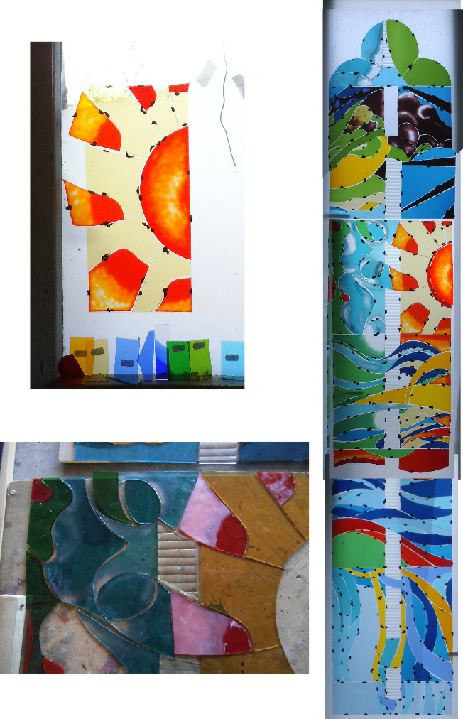
Having cut all the glass pieces I need to check that they look good together.
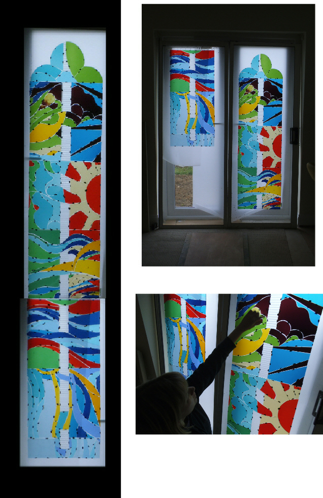
Using plasticine (and two spare doors I kept for the occasion) the glass is stuck onto the door glass so that it can be viewed as a whole , well, nearly, as at 9ft I had to use both doors and a bit of computer trickery to show the 3 sections as a complete window.
Some of the pieces at the moment do not look like they do on the design. These need to be worked on to achieve this through the use of sandblasting, painting and enamelling. So now it’s sandblasting time…….
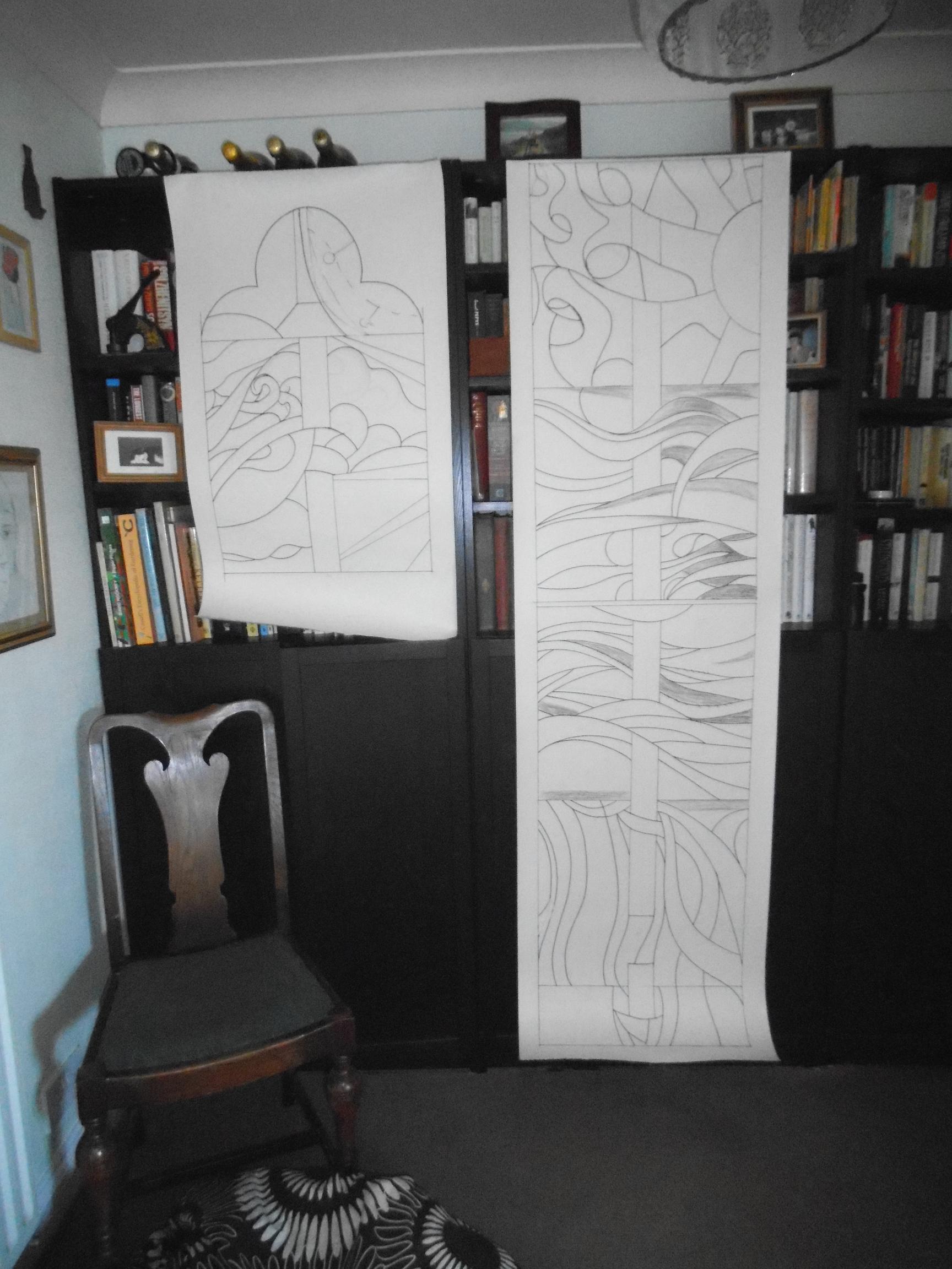
The Full size cartoon
The ‘cartoon’ (Italian for large drawing?) is the full sized drawing that shows all the leadlines so it can be used as a pattern to cut the glass. Traditionally the cartoon would show the thickness of all the leads and all the painting needed but I have just drawn out the ‘heart’ of the lead to save me time. Overall the entire window is 9ft x 18inches approx so I have divided it into 3 panels that will slot into one another to form the whole design. Now this is done I can start to cut out the glass!
What a bit of luck!
Having sorted out the glass colours I want to use for the design I now have to do two things- 1 is to see if I have any of them in stock, 2 is to go and buy what I don’t have.
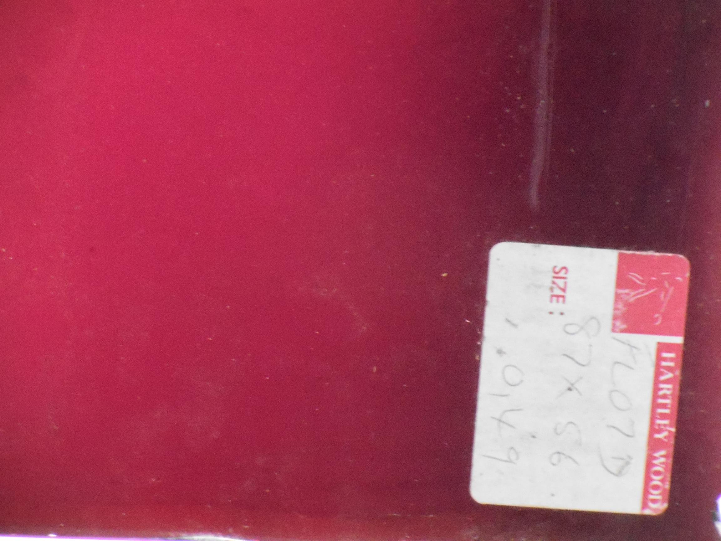
Whilst looking through the glass rack I came upon this- a very rare ( because the manufacturers no longer exist) and expensive ( pink glass is coloured using gold) piece of pink flashed glass by Hartley Woods! Hopefully there’s enough for what I need but it made me very happy as I’ll never find another piece of this ever again! Glad that is is going to go into a Grade 1 listed church!
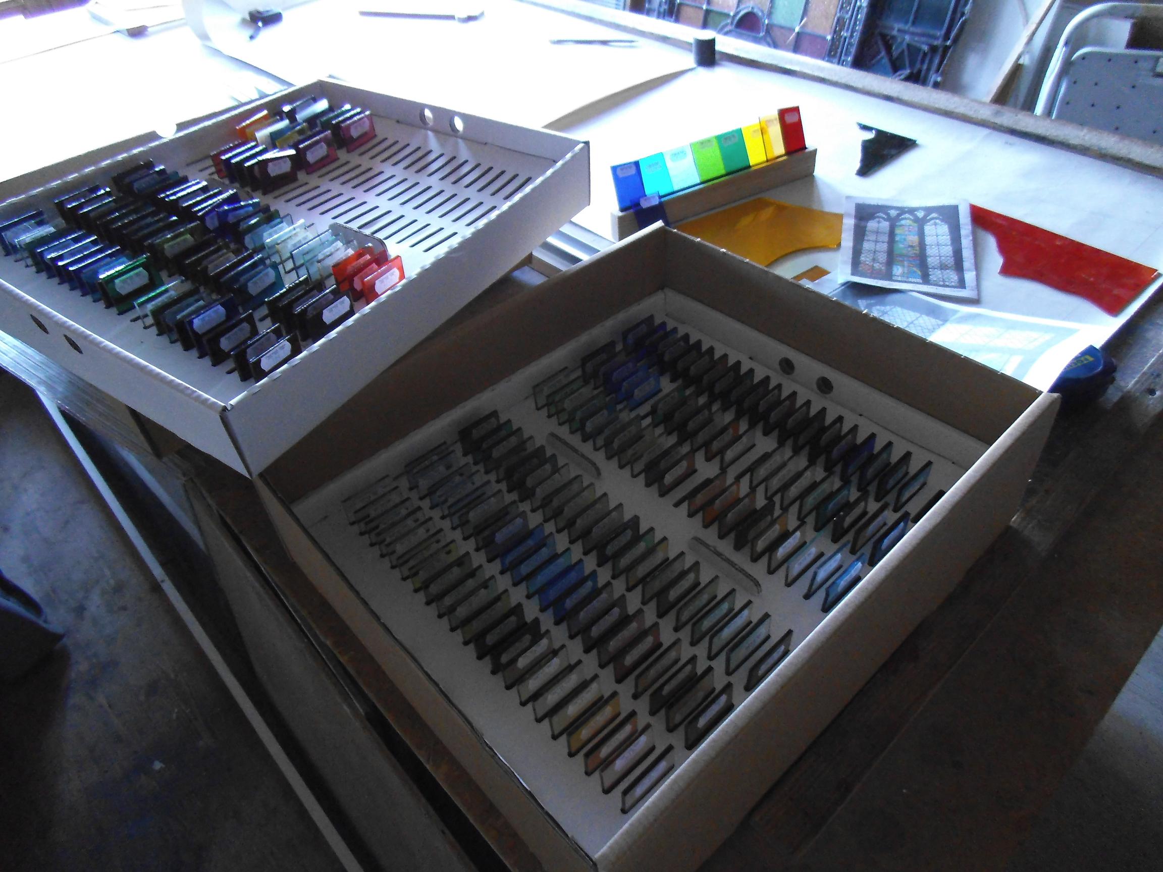
Choosing Glass
This could take a while…. so many to choose from and all just slightly different!
Quality control at work…
All processes in the studio have to pass the strict scrutiny of the QC.
Scaling up the design!
This week the ball has started to roll on getting the window made!
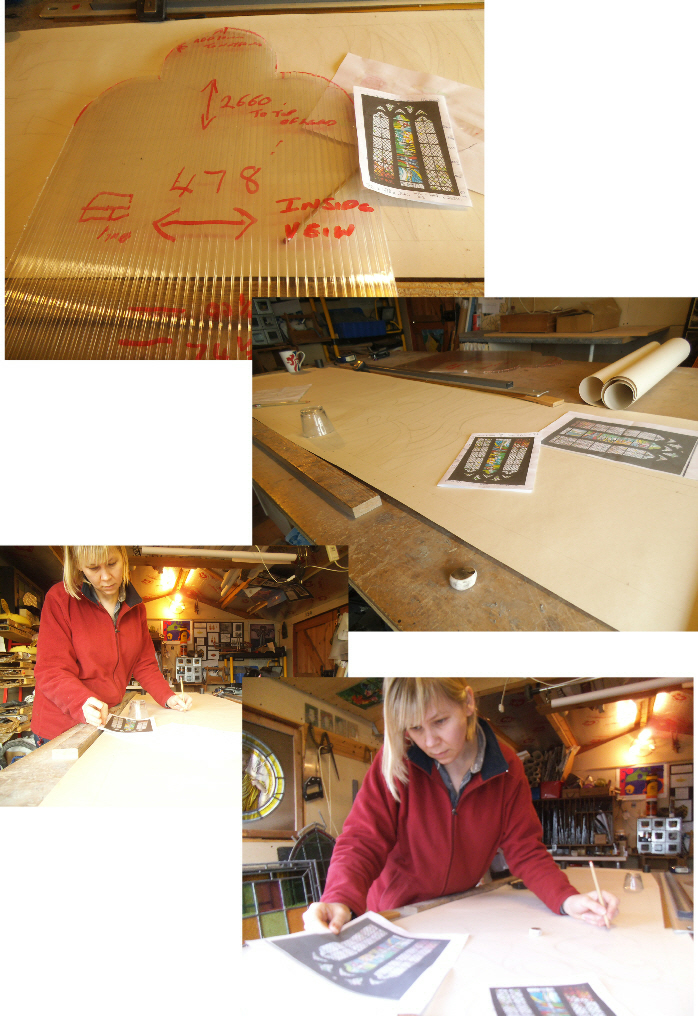
The first step was to take a template of the top of the window to make sure the shape is correct. All measurements were then noted, including placement of glazing bars and their thickness.
As the window is nearly 9ft long it will be divided up into 3 sections.
Once the outline was drawn it was a question of scaling up and drawing out the design full size (note the concentration here!)
Next stop: choosing and cutting glass…..
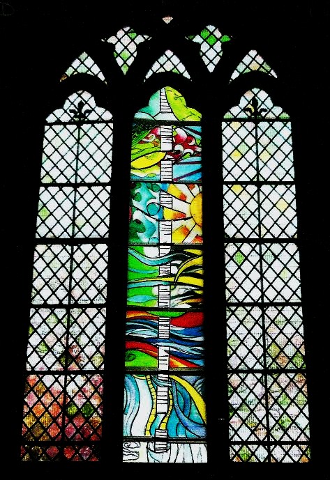
The chosen design
This design was one of the four shown to the representatives of both the school and church. Having considered all the designs, and my explanation behind them, this was unanimously seen to be the most appropriate and chosen to go before the Parish Church Council and ultimately the Diocesan Advisory Committee.
The central ribbon represents Caroline’s work with female migrants, with the bold bright background representing their hopes and fears and the journey into a brighter, but unknown world. Having been to Australia it is striking how different the colour palette of the natural world is compared to the British Isles. Everything seems to be brighter and bolder. Imagine as an immigrant leaving Britain, spending months at sea, and then landing in Australia, a whole new world.
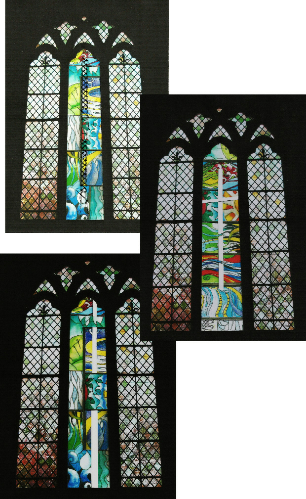
Alternative designs
Using the collage process, and playing around with it, I eventually came up with 4 designs that I was happy to present to members of the school and church.
The key for me was to have a design that drew your eye across the height of the window. I have, hopefully, achieved this through the use of a central motif, which also echoes the iron bar that runs centrally in the windows either side.
The top left design uses sewing, and specifically the ‘corset stitch’ to represent Carolines work with and for female immigrants.
The central design uses a cross to symbolise Carolines faith- a driving force behind her humanitarian work.
The bottom design uses the ribbon motif to again symbolise her work with female immigrants, but is slightly offset against an alternative background design.